Cool Japanese Design: Oasis 21 in Nagoya
On my first trip to Japan, the thing that impressed me most was the architecture. These weren’t just buildings with a nice touch; some of them were crazily unusual, stuff to stop and stare at and take photos of for friends back home. I met a young European architect in Asia that year who said he had left the west because there just wasn’t anything interesting going on. I could see his point. Boring and conservative seemed to be the norm while Asia seemed hell bent on dropping your jaw. Even in Nagoya, a city that most travelers are going to skip, but which I visit on business each year, has its share of cool skyscrapers. I saw the 36-story Mode Gakuen Spiral Towers going up and a couple years later the final product.
It is home to three vocational schools. Really? That’s the coolest campus you’re going to find.
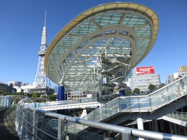
But it wasn’t until this year that, while visiting a new office location, I saw Oasis 21. But it’s been around since 2002. Oasis 21 is a green space around an oval plaza set below ground and surrounded by the underground mall and nearby Sakae subway station. That lower level amid the shops is covered by a huge glass pavilion lifted into the air on columns rising above ground level. All parts of it are open to pedestrians, including the very top of the glass, which has a walkway around the perimeter. But much of the glass roof is covered by water. The wind sends ripples across it which in turn play with the light passing through to the plaza below. (It also allegedly keeps the plaza cooler in the summertime sun.)
Ramps curling around the structure plus an elevator to the top make the whole thing very accessible for wheelchairs and strollers.
It lets some sunlight and air into what is otherwise a typical underground mall around a subway station, something quite common in the cities.
Reflective and transparent surfaces play with the light.
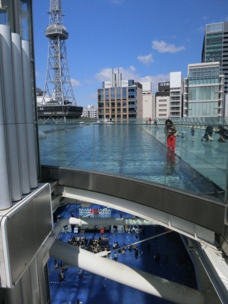
But the coolest aspect is the water pool across the top.
A walkway goes all the way around it.
Underneath the rippling water makes rippling light patterns.
Pedestrian shadows pass along the translucent walkways.
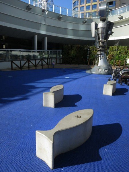
Down inside the plaza is a funky clock…
../. along with some fish-shaped concrete benches…
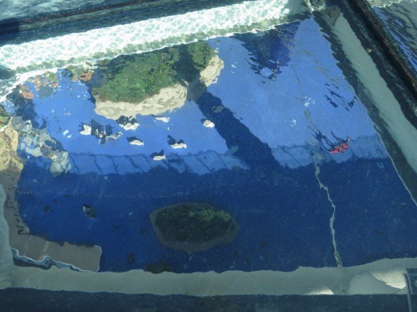
… which look like fish in an aquarium through the water above.
And the whole structure ties into the Sakae station, the bus station and an unusual amount of green space in the center of the city. Not bad, Nagoya!
Read more of my posts about my travels in Japan. For more information check out Oasis 21’s website.









 ORDER YOUR COPY TODAY!
 ORDER YOUR COPY TODAY!
Thanks for all the photos, Kevin. My first response was that it’s a pretty ugly structure and the idea of translucent walkways doesn’t really do it for me, but the way it lets in light and the use of water to create different affects is really nice. I particularly like the way one can look through to objects below to get the aquarium affect. Nice touch!
All the pics are mind blowing.Their designing and engineering work quite different from other countries.
Pingback: Aichi - A Mix of Modern Life And Tradition | japanista
The state of the art of architecture design!
Nice Nagoya !